With my own kids suddenly college-age, I’m hyper-aware of how quickly they grow up. That’s why when I’m photographing a kids’ room, I encourage “grow with me” styling. Ever heard of “grow with me” pants? The hem can come down each time the child grows. Well, children’s bedrooms should be styled like this as well. It’s good photography because it tells an interesting story, that this space is sophisticated enough to evolve with the child, and it’s good design because it demonstrates that the designer has their clients’ best interests in mind. Kids do grow up quickly, and redoing an entire room every few years isn’t much fun. What follows are my tips for ‘grow with me’ styling in the kid’s bedroom (excluding the nursery), for photo shoots and life. Now, let’s put on our big boy pants, and begin!
Tip #1 No Toy Spillage
It’s really tempting to spill a lot of colorful toys on the floor in the foreground of the shot. It’s usually not what you are striving for image-wise when the items are the plastic, primary color kind. A few well placed quality wood toys are fine, but I prefer toys that don’t define a certain age. Blocks and other building toys can look pretty sophisticated, read well in the image, and don’t scream “preschool.” They are often found in natural woods that look good with the other tones in the space.
designer:Sasha Marie Interiors/photographer: Lisa Russman

designer: Sasha Marie Interiors/photographer: Lisa Russman
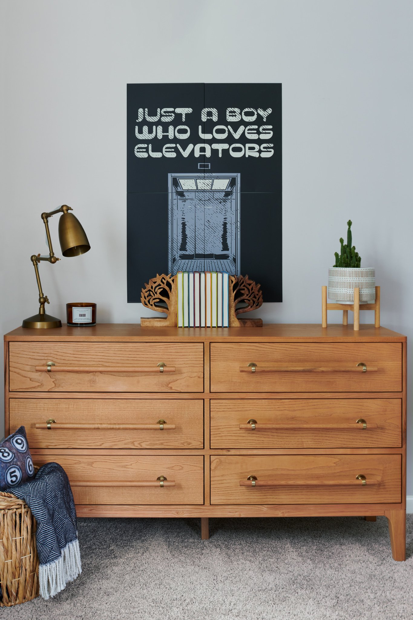
Tip #2 For Scale: Foreground Item
It’s good to anchor a dresser or bed with an item in the foreground, to help with scale. The bigger the item gets, however, the wonkier it can look (too large and too distorted). A basket or stool is often the best choice and the right scale, bringing in colors and textures that relate to other things in the image. In this picture you can see that the texture of the basket looks great with the natural materials on the dresser and the tones look great together. Inside the basket are pillows and a throw that relate to the poster in color, style, and rhythm. Well done, Sasha Marie Interiors!
Tip #3 Think Sequencing or Image Set
Images in a set need to all relate to each other, so when they are viewed together they make sense. The pillow and throw placed in this dresser shot relate to the bedding and props in the overall room shot. Don’t add something to one shot that won’t make sense in the subsequent shots in that same space.
Tip #4 Tell a Story
These two images tell a story. This child loves elevators and all things Pixar. The poster is clever and timeless, the lamp is a nod to Pixar and can be used at any age. The light up connecting hexagons don’t define the age of the child. The colors are playful but the rug and curtains are not age-specific. The pops of orange are fun but also can be found in any room so there is a level of sophistication there.
Tip #5 Make it Pop
You need a pop, whether it’s a pop of color or a surprise. Something to pull you in. Here it is obviously the orange bean bag chair. If that were grey this would be a different image altogether.
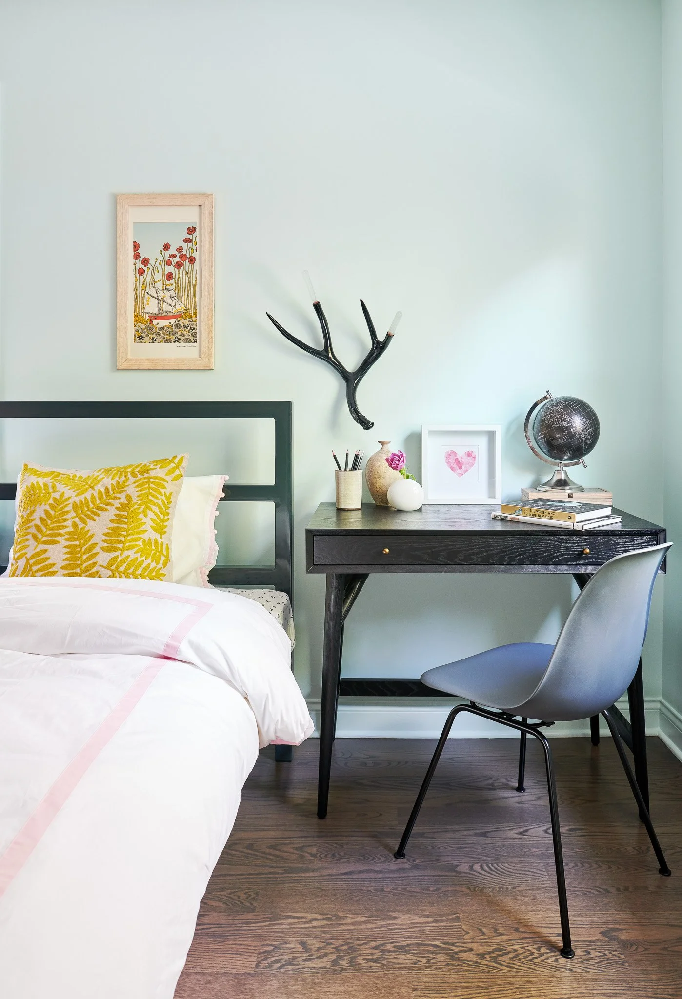
Tip #6 It’s Good to be Odd
Like in life, it’s pretty cool to be a little odd. On desks and dressers, the floor or the bed - all items seen really - should be in threes or fives or sometimes sevens. It just looks better. Let’s say it’s three things. Here are the three categories for picture-perfect surface styling in a kid’s bedroom:
designer: Tina Ramchandani/ stylist: Frances Bailey/photographer: Lisa Russman
Make it living
Be it a plant, flowers, or even a fish, put something living in there. It immediately makes the image look real, not staged. It’s appealing, it’s inviting, and it’s fresh. Always.
Add some character
What’s the item that makes this about someone in particular? Here this kid loves geography and reading. In the dresser image above, it’s the poster. Add something really unique that tells (or makes up) a story about the person who lives there.
Lend sophistication
Weave in that sophisticated item that says someday a teenager or a young adult could live here. Here you see that the sconce and the delicate organic vases lend that feel. Well done Tina and Frances!
Tip #7 Instead of Homegoods or Target…
Oftentimes, when my clients don’t bring a stylist on board, they might hit a Homegoods or Target, load up on items we’ve discussed for the shoot, keep the tags on and hope to return them later. Hmmm….. I’m not going to complain about that, but here’s why it’s often a bad look. Many of these items just look like they are from a big box store. There are a few shelfie items I think I’ve shot fifty times already from Homegoods. And the tags, well they appear in the images and have to be edited out. Here is a BETTER idea, one I encourage to all of my clients: build relationships with local boutiques and artists and BORROW items. They can be tagged in the shots and increase their own visibility online (who doesn’t want their products photographed in actual rooms). It builds community and it supports your local businesses. Boom!
I’d love to hear your thoughts on this post, so please add a comment or send me a message!